
LET’S
GROW
A
HEART
The Challenge
The Great Barrier Reef was top-of-mind among potential visitors to the Whitsundays, but unfortunately, the rest of the diverse region was forgotten.
The Insight
There is something special and genuine about the Whitsundays region. Its locals and its climate share a welcoming warmth; the region is a little rough around the edges but full of people who care for the environment as much as they care for loved ones and neighbours. A diverse place like the Whitsundays, whose people share such a positive and refreshing outlook on life, is a rarity worth treasuring.
BRAND STORY
The Whitsundays are so much more than just a coral coast, or a magnificent wonder to be admired.
It has a heart, a heart that’s pulse resonates through the entire region.
It enriches our sailing, our fishing and our rural towns.
It’s in our generosity, our character, our compassion that extends far beyond people.
It inspires us to protect what we love, and to treat everyone the same, be they high flyers or ordinary Joes.
It’s our signature that’s impossible to imitate, a place where tranquil waters create a sanctuary for all to explore.
A place where our islands are for everyone and no-one at the same time.
A place where wonders flourish and lands provide ample sustenance, where warmth is not just in our climate, it’s in our very nature.
It’s the heart of the place, a place we welcome you to share.

THE SOLUTION
We began by creating a unique signature to represent the region – a mark that can validate any message that meets community standards. Hundreds of different local handwriting styles were sampled and combined to create the authentic, final form.
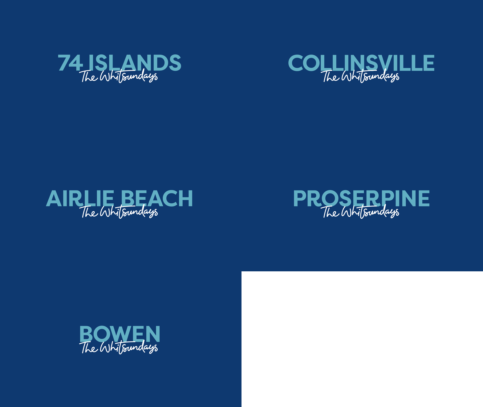
To ensure that all Whitsundays regions are equally represented, we created a variation of the logo for each one. We opted to flip the usual visual hierarchy and lead with the regional names. This way, local pride shines through.
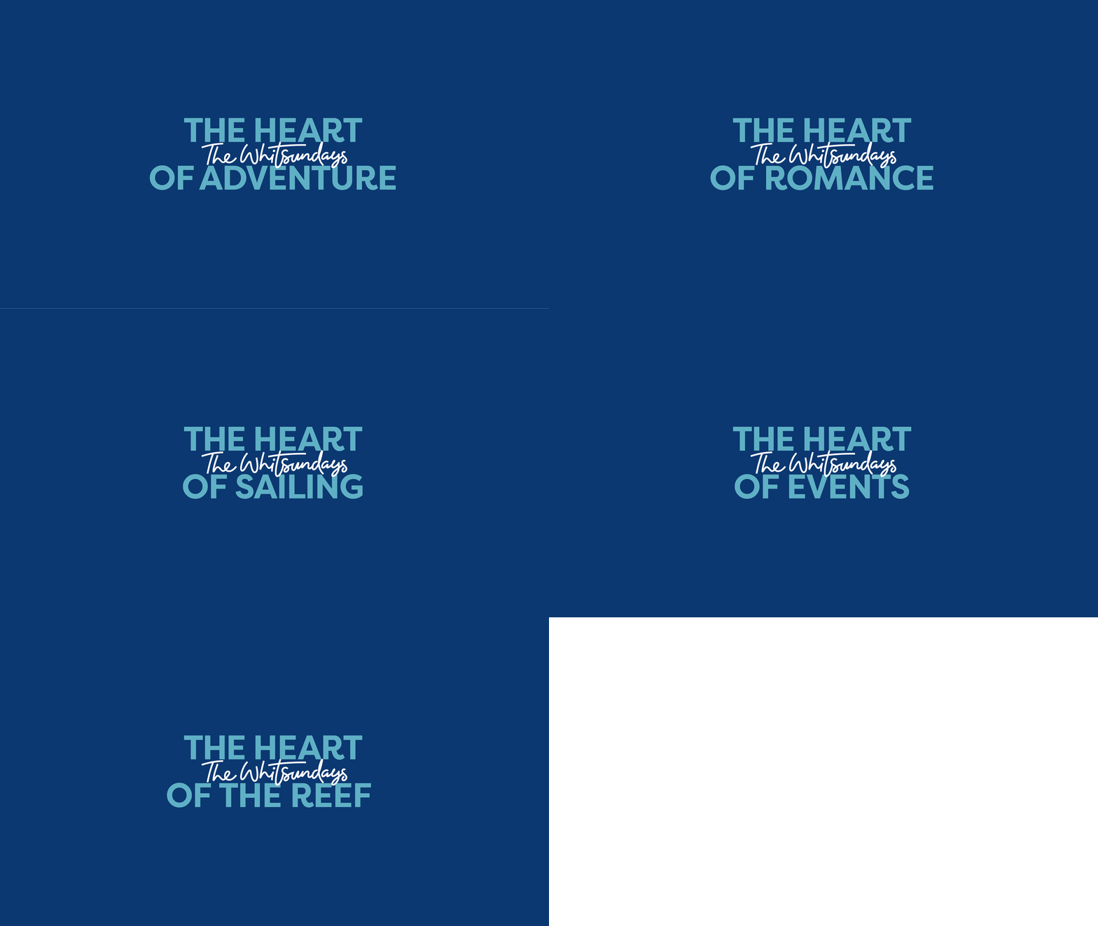
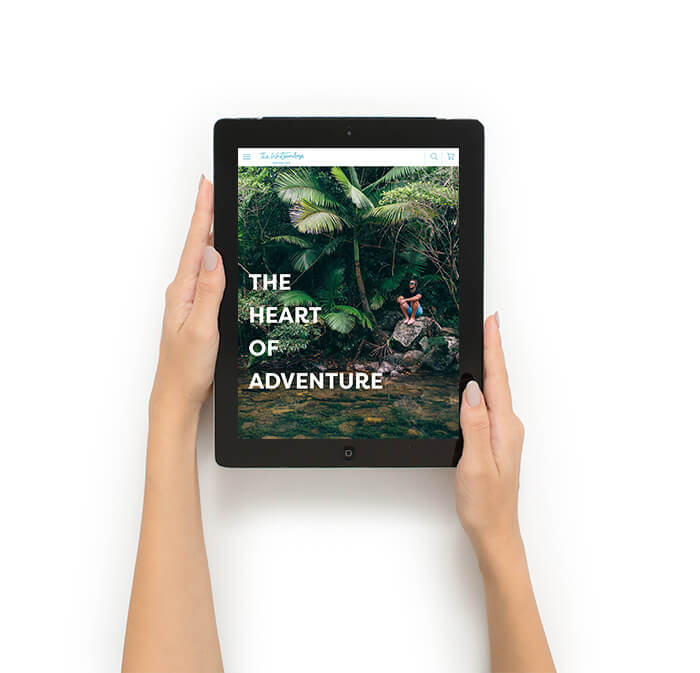
Next, we wanted to bring to life the unique heart and soul of the Whitsundays, which represent the warmth that the place and its people offer each and every visitor. To do this, we engaged the local community once again. We challenged them to articulate how a visitor can best experience this charm.
Collaboration revealed that, although this warm trait is shared by all, how it is best experienced varies from region to region and person to person.
With this insight from the community, we named three key hearts to experience within each region with a plan to continually evolve and grow the list as time goes on. The mayor even affectionately claimed his own: “The heart of bloody good”.
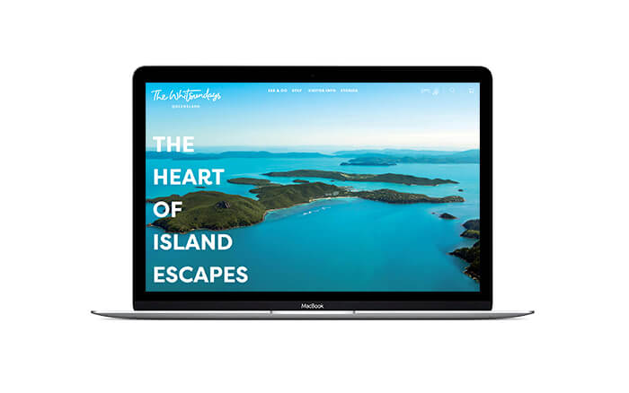
Of course, no brand is complete without its illustration set. Ours is clean and crisp but charmingly rough around the edges, just like the Whitsundays region itself.

