We’re way beyond tourism brochures. Today’s digital marketing ecosystem continues to expand, providing visitors with the inspiration and information they need through endless platforms and channels.
In an era saturated with social media, how can destination marketing organizations (DMOs) find the right role for their website? Let’s talk to an expert.
Self-professed “website geek” Katie Shriner is a visual artist, a website designer, and a content creator for tourism destinations. From web content to coding to information architecture to SEO, Katie has worked on everything web during her 12-year digital career. As Marketing Manager at Destination Think based in Australia, she is often found conducting website audits for DMOs and their tourism operators.

Marketing Manager Katie Shriner speaks about content and events to tourism stakeholders in Campbell River, B.C.
Here are Katie’s eight best website tips for destination marketers, plus a bonus strategy session.
- Above all, help your visitors.
- Add navigation basics.
- Provide contact info.
- Tell us where your destination is.
- Provide info to address niche interests.
Strategy session: Find your website’s higher purpose. - Avoid information overwhelm.
- Build your website to be social.
- Help your visitors find you through search and social.
Katie’s DMO Website Hall of Fame
1. Above all, help your visitors.
“A DMO website must be useful to the potential or returning visitor. Great websites are easy to navigate, and they display helpful information clearly,” Katie says.
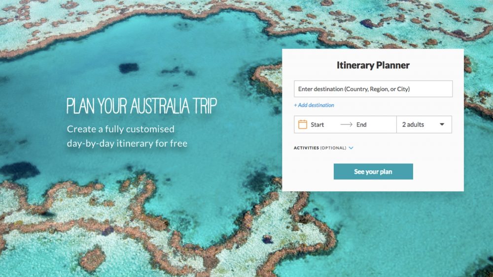
An effective website can help visitors in many stages of the customer journey, including dreaming, planning and sharing. Typically, destinations need to steer clear of direct sales and instead focus on providing inspiration and information to the right people at the right time.
A destination website should reflect the interests of its visitors. Your DMO knows its visitors better than anyone (right?), so use visitor personas and knowledge of the customer journey to help you decide what to display. Worry less about clever copy and more about communicating helpful, relevant information.
Source: www.australia.com
2. Add navigation basics.
What are your visitors looking for? When it comes to websites, Katie says, basic information on activities and the destination’s location are a must.
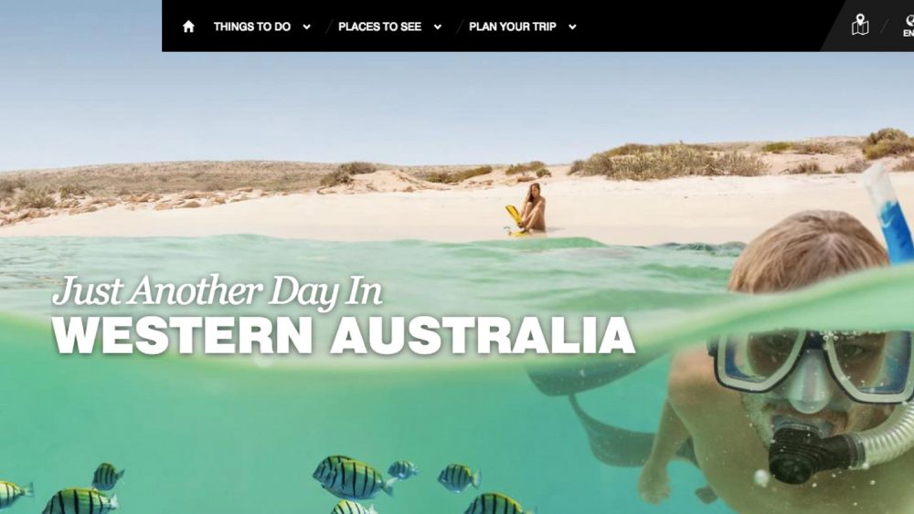
See Tourism Western Australia (a Destination Think client) for a good example. The navigation bar at the top of the page (or in a simple side menu on a mobile device) reads: Things to do, places to see, plan your trip. This helpful information is categorized using simple language that is easy to understand.
Source: www.westernaustralia.com
3. Provide contact info.
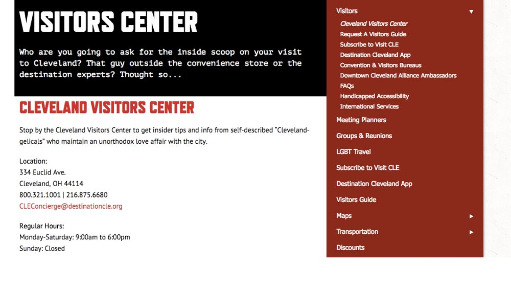
Travellers will sometimes use a DMO’s social media channels to ask questions, but not all visitors are so savvy. Make sure all of your contact information easy to find; this might include visitor centre phone lines and locations, email support, or chat services.
Source: www.thisiscleveland.com
4. Tell us where your destination is.
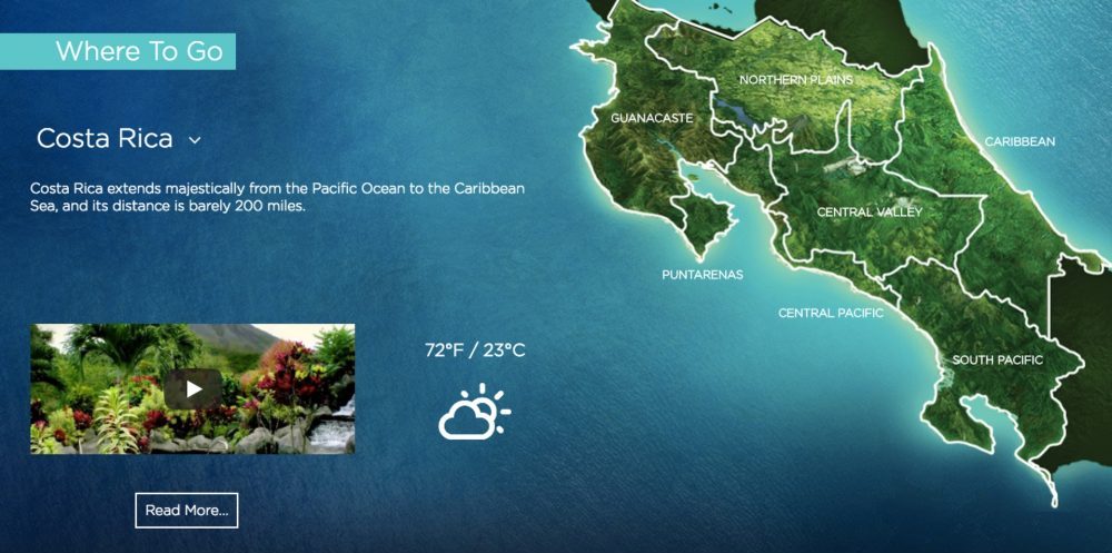
“Don’t assume that travellers know where you are. Too many DMO websites don’t show where their destination is, or what its boundaries are,” Katie says. Simple maps like this one from Visit Costa Rica are one way to make sure your visitors understand the geography and, when relevant, the different regions within.
Ideally, your site will also help them learn how to get there, as this one does.
Source: www.visitcostarica.com
5. Provide info to address niche interests.
Does your destination hang its hat on a few specialties? Visitors interested in those specific activities (like fishing, kitesurfing, birdwatching, or beer tasting, for example) need to be able to learn how to plan those trips as easily as possible.
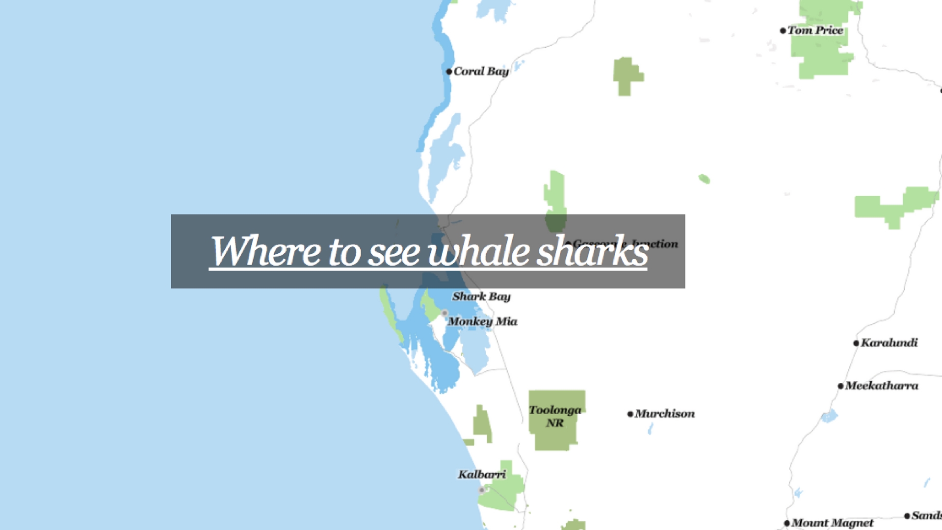
This is especially true for events or time-sensitive experiences. Visitors may want to see the salmon run in British Columbia or watch whale sharks in Western Australia. Up-to-date information is essential.

Source: www.westernaustralia.com
Strategy session: Find your website’s higher purpose.
“With all the information now available to visitors online, should a DMO try to create more of it? For what purpose? DMOs need to think strategically when it comes to web content.”
– William Bakker, Chief Strategist at Destination Think
Let’s ask some important questions.
What really makes your website a success? Is it traffic? Is it clicks? Is it beautiful images, or a viral blog post?
Think bigger. While it is useful to measure how many visitors your website gets and what they are most interested in, don’t overvalue those KPIs. Instead, your website must find its higher purpose related to the destination strategy. Destination Think CEO Rodney Payne says it this way:
“It’s hard to draw a business case that correlates awareness (read: eyeballs on a website) to business impact these days. To be effective, you need to get specific with what you’re measuring. High-level KPIs lead to non-specific blanket solutions, which causes stakeholders to question the relevance of the DMO.”
At Destination Think, we have spent many years and late-night conversations discussing DMO metrics and what success means for a destination. We’re nerdy that way. In fact, William Bakker has given a whole presentation on how your DMO can measure success in the new marketing world. He suggests using these four metrics to measure success:
- The destination experience
- Consumer engagement
- Operator effectiveness
- Corporate transformation
Whatever you do with your website, make sure it is designed to help your DMO achieve success with higher-level KPIs like those.
Now, back to Katie’s best website tips.
6. Avoid information overwhelm.
When it comes to clear communication, less is often more. Destinations need to carefully design the information architecture of their website to provide the most useful visitor information at exactly the right time. Sometimes this means saving lengthy descriptions and detailed histories for a blog post, and keeping most web pages – especially home pages – minimal and focused. This way, visitors will spend time and energy on dreaming and planning their trips, instead of on sifting through redundant information.
Bonus tip from Katie: “Many effective DMO homepages use a slideshow of inspirational hero images. A moving hero slideshow is a great way to give people a snapshot of your destination.”

Source: www.thisiscleveland.com
7. Build your website to be social.
What is your website’s role in your digital marketing strategy? Katie takes the bricks versus feathers approach.
“A good DMO website is the glue that holds all of the social elements together,” she says. Larger pieces of content like trip planning guides or video series (bricks) are surrounded by many smaller pieces of content shared through social media (feathers).
“This approach treats a website as a platform that can be broken into bite-sized bits that can be shared as needed and integrated into the social calendar.”
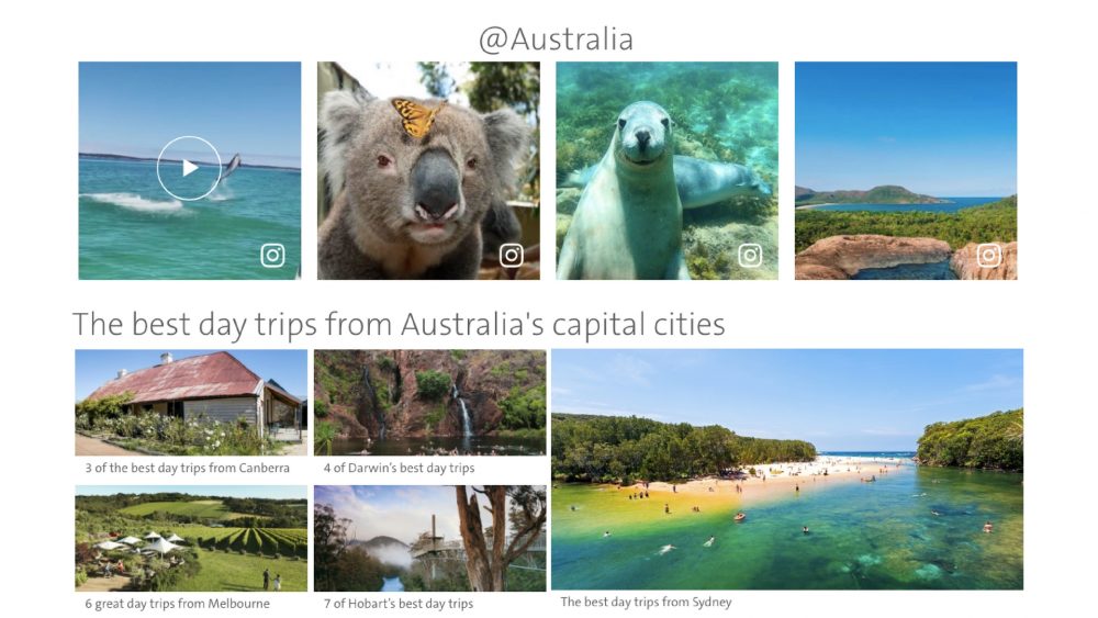
Source: www.australia.com
8. Help your visitors find you through search and social.
Even the most helpful pages are useless if no one can find them. That’s why the details in the backend of your website are just as important as the content in the front.
Be diligent with metadata to make sure that visitors can find your website in searches. Use topic keywords in your page titles and descriptions. Keep descriptions brief so that they aren’t cut off in search previews. Write page URLs that match your keywords. Spending time on details like these, or hiring an expert to help, should improve your SEO and increase the chance that visitors will find the helpful information they are looking for.
You can also help others share your best content through social media. When someone shares a link, social platforms like Facebook and Twitter will pull a link preview and description. Be sure that you use engaging preview images and a compelling description for each page. Not sure how your pages will look? Test a link using Facebook’s Sharing Debugger to see how it will appear in the News Feed.
Katie’s DMO Website Hall of Fame
Drumroll, please! Here are some of the very best destination marketing websites online today (as of February 2018). Katie says it was hard to narrow her list down to five favourites, given all that she’s seen. But for today, here are her top DMO websites, and why she chose them:
#5: Tourism Australia
The website copy is easy for the traveller to understand. For example, see “Places to Go, Things to Do, Plan Your Trip”. The site also lists popular attractions and activities for first-time visitors on the homepage to encourage time spent on page.
#4: Costa Rica Tourism Board
https://www.visitcostarica.com/en
The content focuses on the niche traveller (eco-friendly, outdoor, environmentally and culturally conscious). It shows where Costa Rica is and what it entails with an interactive map on the homepage.
#3: Destination Cleveland
http://www.thisiscleveland.com/
Cleveland’s website reflects the destination’s Place DNA®. It manages to cover a lot of information while retaining clear navigation no matter where you are on the page.
#2: Tourism Western Australia
https://www.westernaustralia.com/au/Pages/Welcome_to_Western_Australia.aspx
This site focuses on real traveller stories and features an interactive map of Western Australia on the homepage with suggested itineraries.
#1: Margaret River Busselton Tourism Association
https://www.margaretriver.com/
Easy navigation and a focus on local stories make this site a winner. The DMO’s social channels plus Contact, Accommodation, Tour and Events links remain in the top navigation no matter where you go on the site.
Inspired by great content? Want to take your destination marketing strategy to the next level? Watch William’s presentation on how your DMO can measure success in the new marketing world, or see how Katie and Southern Queensland Country Tourism created helpful, eye-popping web content for visitors.






Awesome useful tips. As we’re currently designing our website with a leading web design company in Sunshine Coast, Here I got great useful tips to implement on our website. Thanks for sharing useful tips.
I loved this article, thank you for sharing. We’re a small marketing agency and are building websites, and this was very useful.